

An early stage start-up simplifying property transactions with more transparent and cost-effective solutions.
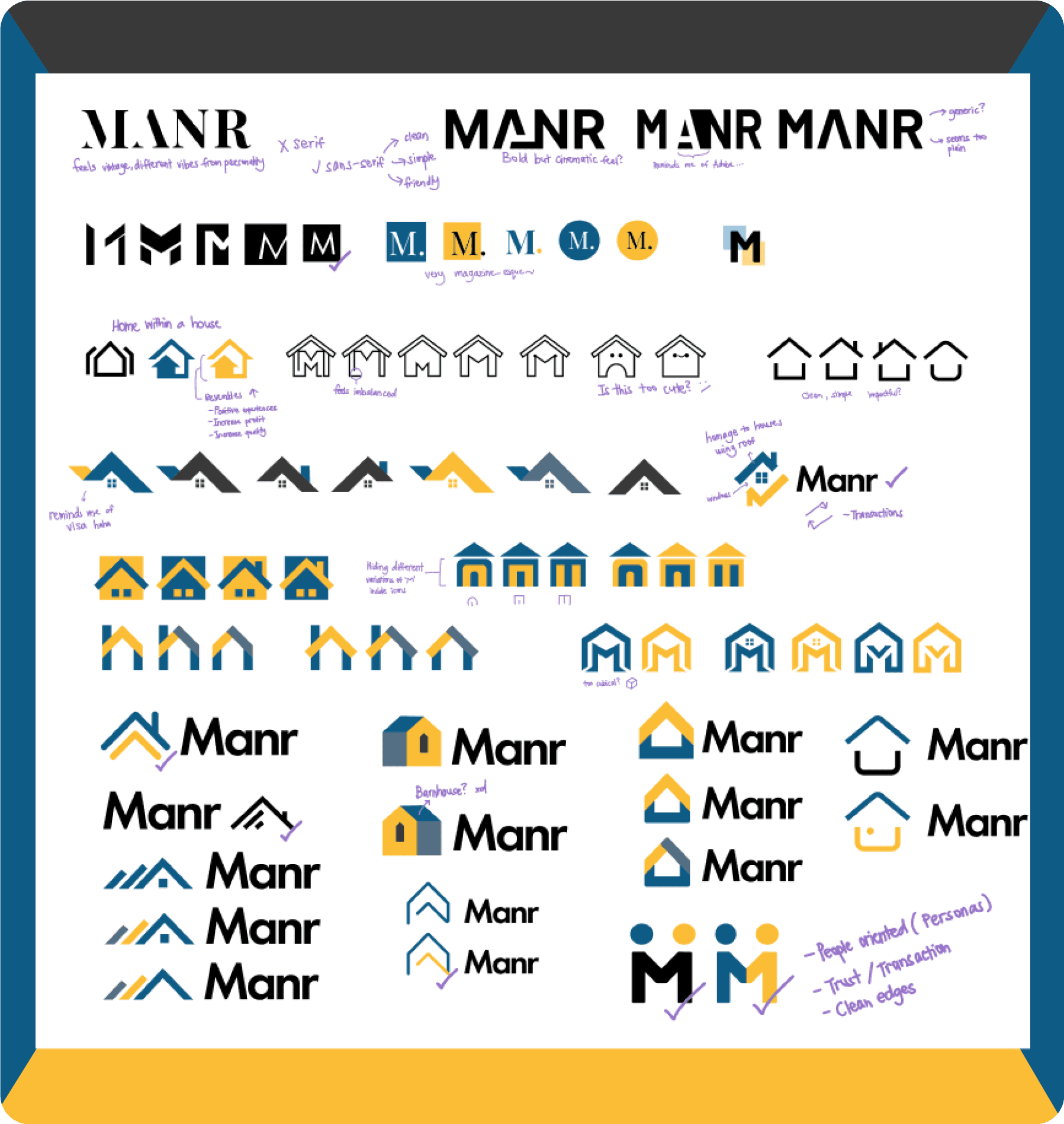
Manr gave me the green light to go all out! Inspired by moodboards and color psychology, I created a vibrant visual identity, balancing professionalism with playfulness for an engaging real estate experience.


UX AUDIT AND RESEARCH
So, how and why is it difficult to use Manr’s platform?
Convincing management that user research is important in a busy startup was initially challenging. However, through our competitor analyses, surveys, task analyses, and interviews, we identified several crucial issues.

Lost in Navigation
Users found the website layout confusing

“I don’t think I’d trust this website”
Bad experiences hurt Manr's credibility

“This doesn’t make sense”
Users became frustrated when what they expect doesn't match what they see.

Abandon ship
Users, discouraged, lost interest quickly


Creating a scalable website.
The website needed to be flexible enough to update house listings, add articles, and other integrations. With future development outsourcing in mind, creating a simple yet robust design system with clear guidelines was crucial. These guidelines ensure consistency and visual balance.


Results
After four months of hard work, Manr has been completely transformed. This journey taught me valuable lessons in advocating for user experience while balancing stakeholder needs. This journey taught me valuable lessons in advocating for user experience while balancing stakeholder needs. Working with a startup for the first time has been challening but fun, it has allowed me to wear many hats and grow personally.
